Napoleonic French Infantry
I originally wrote this article for online wargames magazine Wargames Journal, and after a request for a copy have decided to republish it here, making some updates.
I developed this technique before I’d even heard of Kevin Dallimore and his layering system. When I switched to 15mm, from my careful blending technique for 28mm, I used to block paint, then wash figures with diluted Daler-Rowney Translucent Brown Cryla acrylic, then go over them again to restore the main colour and leave shadows. I came to the conclusion that it would be quicker to just paint the shadow colour first, forget about the wash, and then paint the mid-tones.
I largely think that for wargames purposes, two-tone shading is enough, even on 28mm figures. I do sometimes add a highlight to cheeks and noses on faces because it makes the face of even a 15mm figure pop. I don’t like hard black-lining, and my technique gives a softer effect. I still use it to this day, whenever my failing eyes let me.
I wrote this article before I even dreamed I would become the EU agent for AB Figures. When I ran a painting service, AB were simply the best 15mm Napoleonic figures anyone who enjoyed painting could paint. Even the latest 15mm ranges from other manufacturers have failed to change my opinion on this: they are simply not as detailed, refined or anatomically correct as an AB figure.
Ian Marsh, 2 May 2015
===
French infantry are an essential part of most Napoleonic gamer’s or gaming group’s forces. Turning an army of otherwise unremarkable, blue, white and black tokens into passable representations of the uniforms isn’t difficult and doesn’t require a complicated shading and highlighting process: one level of shading is enough, at least for something that has to stand out on a wargames table and even withstand the scrutiny of other gamers.
The layering technique I use turns out 15mm scale infantry at a fair pace. The aim is simply to shade major areas of a figure with a deeper hue of the base colour, and to paint the main colour over it, leaving borders of shade between differences in relief on the moulding and between different colours. Some areas don’t get shaded this way at all – the effect isn’t noticeable enough on this size of figure. Much of the effect, in fact, relies as much as on what isn’t painted as what is painted.
As well as technique, reference material is vital, but even for something as common as the French line infantryman sources can be a nightmare. Opsrey guides are a useful start, but the absence of some views in plates mean there is always some element of dress that’s in question. My chosen subject, The Terrible 57th, however, is detailed, with the main distinctive elements – musicians’ uniforms and voltigeur distinctions – covered. That’s not to say there aren’t discrepancies, particularly on fine details of the drummers’ uniform, and inevitably it is essential for any painter to exercise colonel’s discretion based on available sources. Colonel’s discretion is, of course, the moment when a best guess is all that is possible, and it has been used here.
Out of preference the figures used in this article are from AB. Slightly larger than most 15mm ranges, these figures are well detailed, with plenty of folds that make finding the shadow areas of a figure easy. Crossbelts and fine details are well defined, making them a good choice for a painter who wants to learn and practice a technique. [Update, 2/5/2015. Yes, AB Figures are more costly than other 15mm ranges, but for a painter there are none better.]
Materials, both brushes and paints, are solely the choice of the individual. I use acrylic paints, largely from art shops, because they dry quickly and are so much more pleasant to use than enamels. Craft acrylics from art shops come in containers about twice the size of hobby paints and at about the same price per pot, making basics such as white, blacks and browns a much better buy. Some craft paints, however, have coarse pigment and should be avoided. The rapid drying time means that in a unit of 24 figures, the first few are easily dry by the time the next stage is started.
Brushes, whichever ones you use, must have points, and cheap brushes quickly lose them. Pro Arte Prolene brushes have done good service for me in sizes 1, 0 and 2/0, and although the tip inevitably curls after heavy use in water, the point remains serviceable for longer. [Update, 2/5/2015: Because I sell Coat d’arms brushes, I now use these because I have lots to hand! They are comparatively inexpensive, and when one becomes unusable because it loses its point, I simply dispose of it and use a new brush.]
Stage 1

Clean up the figures by cutting off unwanted lumps of metal and filing down mould lines. Pay particular attention to the areas between the head and the greatcoat roll, between muskets and the shako, between the legs, and down the outside of arms and legs. File and level the underside of the bases now, not when the figures are painted, to make sure the figures stand upright rather than lurch drunkenly into action. I use a Swann-Morton scalpel and pointed blades, available from art shops, though a craft knife is just as good. A Stanley knife and tin snips are better for tackling larger lumps of metal. A small rat-tailed file is ideal for filing in-between legs and in other hard-to-reach places; a flat file is best to level bases. Use of protective glasses is advisable when cutting with a knife in case a blade snaps, and disposable plastic gloves will help prevent too much contact with lead dust. [Update, 2/5/2015: Prince August of Ireland sells some pretty handy snips that cut flat and flush to the surface of a figure. I like them for removing errant sprues from bases.]
Mount the cleaned up figures on temporary bases to ease handling. I use card bases, with figures mounted as opposed pairs, with a blob of PVA glue to hold the figures in place. PVA glue will hold the figures securely enough until they are finished. Allow the glue to dry thoroughly – at least overnight.
Stage 2

Black prime the figures. Don’t be tempted to use water-based acrylic paint as a primer as it’s too soft and will rub off exposed areas subject to repeated handling. Aerosol paints are wasteful and don’t run into crevices well unless heavily applied, so the most economical and thorough way is to brush prime first and then finish with a light spray. I use Humbrol matt black enamel, applied with an old brush, taking care not to run too much into crevices, where it can pool and obscure detail. When it’s thoroughly dry, give figures a light spray of matt black from an aerosol to give a uniform black finish. A light touch is essential: too much primer obscures detail.
[Update, 2/5/2015: Alas, Humbrol seems to have changed the formula for its matt black enamel, and it’s not the paint it was. I now find a black acrylic aerosol is the best option, touching up undercuts and crevices by brush with black acrylic. Artist’s gesso is a terrible option, BTW – it’s designed for canvas, not metal, and is quite coarse. Put it on a finely detailed figure, and it will simply fill in and obscure detail. I have never found it necessary to use specialist metal primers on my figures.]
Stage 3
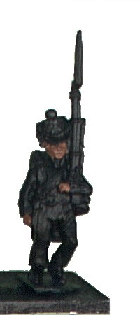
Tackle the face first. Black priming is a grim technique for the first few stages, so the sooner figures begin to look recognisable, the better. Starting on the face first helps markedly. Paint the face, hair and hands a soft brown. This provides the shadow colour for the flesh, and instant hair colouring. Try not to run paint over the cuffs, collars and shakos.
Stage 4

Creating a recognisable face is easy. With a finely pointed brush paint flesh colour lightly down the nose. Then put in the top lip, and blob in the cheeks, chin and ears, leaving a fine gap of the soft brown shading between nose and cheeks, nose and top lip, and top lip and chin. Slight wobbles in the lip line and variations in its width are fine – they’ll give each figure a different facial expression.
Leave a slightly broader gap between the ears and cheeks, but paint in the jaw line. Either this will create natural large sideburns for figures whose shako’s chinstrap is worn tied up, or it will later provide shading for the chinstrap itself.
Also leave the eye cavities in the shade colour. In 15mm, eyes should appear no more than dark slits, so there is no point inflicting figures with googly eyes.
For figures in bicornes or for figures without shakos, it may also be necessary to paint in the forehead, forming the top of a T with the nose.
Blob in the back of the hands, and paint flesh lightly down the thumb and finger lines, trying to leave a fine gap of the shade colour between each. Again, at 15mm scale, it doesn’t matter too much if a few are missed; the separation of thumb and fingers is enough.
Stage 5

Paint the jacket a deep blue, such a navy blue, trying not to put blue onto the collars, cuffs, turnbacks and so on, but painting over crossbelts where they run over the jacket. Don’t use the paint too thick; ideally it should run more into the crevices and be thinner on raised areas. Rather than trying to use black to provide the contrast, the aim here is to use a deep blue darkened even more by the black primer. The different once the paint is dry can be hard to spot, but will show up in the finished figure. [Update, 2/5/2015: I now use Coat d’arms 161 Deadly Nightshade.]
Paint the eagle bearer’s pole navy, along with the drum hoops.
Stages 6 and 7
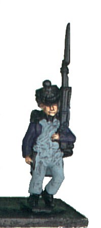

I like to get several of the shade colours over and done with at this stage. Using a light blue grey, again slightly thinned, paint over the turnbacks, trousers, drumskin, lapels, and crossbelts where they run over the lapels without running over onto the areas painted navy in the previous stage. A blue grey is better than a straight grey as it stops the shade colour looking too dead. For a dusty look, use light tan as the shade colour instead of a light blue-grey. The crossbelts will therefore be shaded blue-grey where they cross over the lapels and navy where they cross over the jacket. The paint may dry unevenly, but provided the shade colour has gone into the crevices, this doesn’t matter; the main colour will cover up any dark raised areas. [Update, 2/5/2015: I used to use DecoArt Heather Blue, but Coat d’arms 150 Shadow Grey is close.]
Don’t paint the drummer’s lapels at this stage – as the drummer of the Terrible 57th, he gets special treatment.
Paint the bayonet scabbard, musket stock, backpack, officer’s boot tops, the mid-section of the drum, the eagle and any leather water bottles a deep brown.
Your figures now look fairly dour fellows – a row of cheery faces in a very muted version of their final uniform. At this point you may wonder how they’re ever going to look right, but the next two stages will fix that.
Stage 8

Paint the jacket a mid-blue. Choose a lighter blue than is historically accurate: 15mm figures need lifting by using brighter colours, especially because they’re being painted up from a dark undercoat. You’ll need to experiment to find a blue that’s right. Don’t paint into crevices or folds, or up to boundaries with lapels, backpacks, cuffs, cartridge boxes, and crossbelts. The idea is to leave the navy blue shade colour in these areas, with wider areas between arms and chest, where the most shadow falls.
[Update, 2/5/2015: I used to use DecoArt Crafter’s Acrylic Truly Blue, but now favour Coat d’arms 110 Royal Blue or Vallejo Prussian Blue. I must emphasise that the choice of blue is entirely personal for the scale of the figure and the intended viewing distance. A truly authentic blue for a French uniform will look black at almost any distance, and therefore wrong on a 15mm figure. Anyone who tells you that your chosen blue is wrong is a twit, because the right blue is simply the one that gives the desired effect at the intended viewing distance.]
Paint the eagle bearer’s pole mid-blue, leaving some navy at the top before the eagle and around the hands. Paint the drum hoops, leaving navy next to the cords.
It may not be obvious, but on 15mm French infantry, the only place where the blue of the tunic is noticeable is on the arms or between the turnbacks. If these areas are largely mid-blue, your figures will look right from a distance; you can let the navy blue do the work on the chest between arms and lapels if you don’t want to do too much fine brushwork.
Stage 9

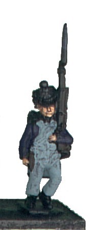
This stage starts to make the figures look the part. It’s the longest and most intensive stage, but it can be broken down. Most of the white is done here, and it’s because most of a French infantryman’s uniform is white, and because some of the most intricate work is in white that it’s the stage where you can hit a mental wall.
With a fine brush, blob in the cockade and, using a series of small blobs, the cap lines. Do all of these, except the cap lines on the officers, before moving on to paint in the straps on the backpack and greatcoat roll of each figure, as well as the musket slings. Try not to cross over onto the backpack or musket as that is already in a deep brown shade colour. Leave a thin sliver of black between the musket sling and dark brown stock if possible.
Take a break for your own sanity. Then paint in the crossbelts, other straps, turnbacks and lapels, again with a finely pointed brush. Leave a line of blue-grey between the crossbelts and the lapels, and especially where one belt crosses over another. Leave a line of navy between straps and the jacket. This provides a more natural shade colour than a straight black.
Finally, do all the trousers. Leave creases in blue-grey at the back of the knee, around the crotch, between the jacket and trousers and between the lapels and trousers. Emphasise knees and folds on the front by leaving slivers of blue-grey. As a guide, paint white over areas that show black beneath the blue-grey shade colour. If necessary, go over with a second, thin coat of white.
[Update, 2/5/2015: Don’t fake folds where folds don’t happen! If cloth is tight over a part of the body, such as the front of the thigh, it should be white, not have some random shading in it. Similarly, crossbelts are robust pieces of leather not prone to kinking and do not need random folds; instead, leave the shading where belts cross over. I hate with a passion Kevin Dallimore’s fake folds on crossbelts!]
On the drummer, don’t paint crossbelts on the front, or the lapels. Do, however, paint the drumskin and outer cords, again leaving a fillet of shade colour.
Stage 10

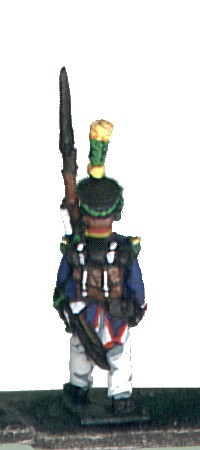
Time for another shade colour. Paint all cuffs and collars a mid brown, leaving a fillet of navy between the brown and the mid-blue of the jacket. Paint grenadiers’ plumes, caplines and the monkey’s backsides on grenadier caps brown too. The brown gives the later stage of red more chance to show up compared with painting straight over blue or black.
Don’t paint the drummer’s collars or cuffs.
Stage 11
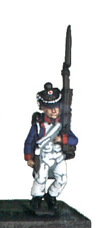
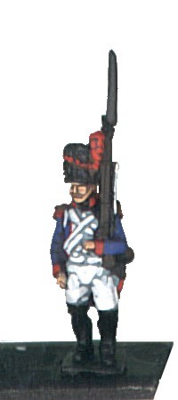
Moving onto the collars and cuffs presents a problem. Red acrylic paints are notoriously poor at covering underlying colours. Applied over white they show streaks; applied over black they become muted and brownish. The cure is simply to go over the red again once the first application has dried, and not to thin the paint if possible. [Update, 2/5/2015: My preferred red nowadays is Vallejo 909 Vermillion.]
Carefully blob in the centre of the cockade, leaving a thin perimeter of white, and the cap lines of grenadiers. Paint the collars, cuffs and grenadiers’ epaulettes, leaving shade colours between them and the jacket, Finally, pipe the lapels, shoulder straps and turnbacks using a finely pointed bush. Apply lines of blobs up the grenadiers’ plumes, leaving irregular slivers of brown between them.
Applying red to the centre of the cockade is as far as it is necessary to go in 15mm. It takes a very steady hand and fine brush to drop a pinpoint of blue into the centre of the red, and to me the effect has never been worth the effort. The red is enough to ensure that the men aren’t mistaken as supporters of the decadent Bourbon regime.
On the monkey’s backside on the grenadier caps, apply red but leaving a rough circle of brown adjacent to the fur.
Stage 12

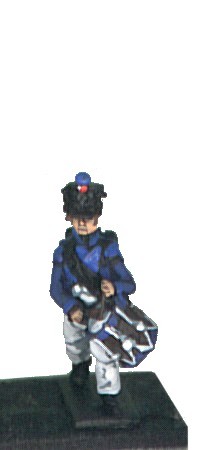
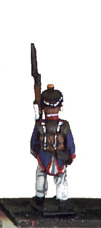
More shade colours. Paint the lapels, shoulder wings, collar and cuffs of the drummer a light mid-blue. Paint the pompoms of the individual companies light mid-blue, dark orange, deep purple and dark green, and the plumes, cap lines and epaulettes of the voltigeurs dark green also. Paint the pompoms of the eagle bearers and any other officers of HQ staff light blue-grey.
Stage 13

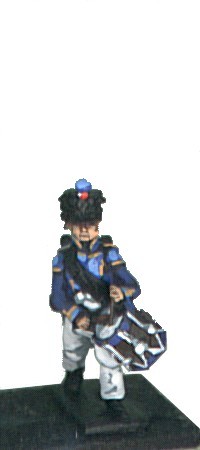
Paint the drummers’ lapels collar and cuffs light sky blue, leaving the shade colour showing at borders. Finish off the pompoms, painting over the respective shade colours with light sky blue, orange, purple and mid-green, leaving most of the bottom hemisphere in the shade colour. Blob along the voltigeurs’ cap lines in mid-green, in lines up the plumes, and on raised parts of the epaulettes.
Stage 14
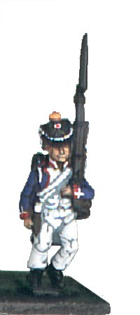
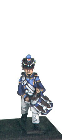

Pipe the drummer’s lapels, collars and cuffs in orange, and shade the balls and tops of the voltigeurs’ plumes in the same colour. Pipe other collars and cuffs in white, and paint the drummer’s crossbelts. Touch up any errors made earlier when piping with the red with white,
French cuffs had several patterns, and the easiest representation of one type is to neatly pipe round the top of the red cuff and then put a white cuff flap vertically up the arm. Technically, it should also be piped red, but the cuff will look convincing enough without this fine detail. Anyone who isn’t up to piping the cuff should just put in a white cuff flap to represent the style. Cuffs with blue flaps piped red or white just don’t show as well on this scale of figure.
Paint the grey-shaded pompoms of any officers white, leaving some grey showing on the underside. Add fine white crosses to the grenadiers’ red cap patches.
Stage 15

Using tan or a mid yellow-brown, paint the backpack, musket stock, bayonet scabbard and any natural leather. On the pack, paint around the white straps, leaving shade colour visible here and where the pack meets the jacket and greatcoat roll. Leave the underneath of the pack entirely in the shade colour. On the musket, paint almost up to the lock and the bands securing the barrel to the stock, again leaving some shade colour showing. Leave a sliver of shade colour adjacent to the barrel. Draw the brush over the top only of the bayonet scabbard in effect to highlight it and leave dark brown on both sides.
Stage 16
Now all the work behind the greatcoat roll is complete, this can be given its shade colour, a warm dark grey. Paint up to the straps and the shade colour of the backpack, but leave some black where the roll meets the jacket.
Stage 17


Complete the work on the greatcoat roll, using a warm light grey, Paint almost up to the securing straps to leave the darker grey showing, and leave the shade colour next to the pack too. On the ends, paint the raised spirals of the roll, leaving dark grey recesses.
Stage 18

Moving onto the metalwork, paint the lock, barrel, securing bands and bayonet of the musket silver. Leave small gaps of black between each component. Any runs over onto the stock should be touched up with dark brown, black or tan as appropriate after the silver has dried.
Stage 19


Apply gold to the shako plate, chin scales, drum body, eagle, sabre hilts, scabbard reinforcements, and officers’ epaulettes and cap lines. Apply to raised areas where possible, leaving a shadow of brown or black to hint at detail.
Stage 20

Touch up any black areas that have mistakenly been painted during the previous stages – cartridge boxes, shakos around the cap lines, pompoms and hairlines, sabre scabbards, boots and gaiters. Then using a touch of charcoal black (a deep bluey grey) go over edges, reinforcings, gaiters and toes, leaving most of the area the original full black. On bearskins, try using short strokes to enhance the impression of fur. [Update, 2/5/2015: Coat d’arms 516 Iron Grey gives a subtle effect; Coat d’arms 533 Slate Grey gives a more pronounced effect.]
After the figures are thoroughly dry, varnish them using two light coats of matt spray varnish. Allow each coat to dry completely. Matt varnish goes glossy if applied too heavily, so using two light coats will leave them matt or with a slight, warming sheen.
[Update, 3/2/2015: My varnishing technique has changed to give more robust protection. I now give figures a brushed-on coat of Ronseal Satin Diamondhard Floor Varnish, let it dry for 24 hours, and then finish with a light coat of matt spray varnish. I’ve had customers unintentionally drop display figures varnished this way and they’ve survived without chipping. Don’t use a cheap floor varnish – the Ronseal is worth it.]
The figures can simply be popped off their temporary bases if they’ve been stuck down with PVA glue. Either they’ll pull off with little resistance or they’ll need lifting off with the help of a scalpel blade.
Basing figures is really beyond the scope of this article. For the sample unit here [Update, 2/5/2015: the photograph for this stage was provided by Wargames Journal and I do not have a copy], I used a simple gritting technique. First the figures were stuck to their final bases, and once the glue had dried, the base surrounding the figures was painted with dilute PVA and dunked in sand. The aim is to level off the top of the base, so the sand comes up to the top of the base of the figure, not over it. Once dry, the sand and the figure’s base itself were painted with a slightly diluted mix of light earth brown acrylic paint and PVA, which was drybrushed sand when dry. Patches of dilute PVA were then dabbed on top and the whole dunked in green static grass. Static grass is pretty nasty stuff, so disposable gloves and a dust mask are recommended when handling it. If you can, apply grit and static grass in a separate area from your painting table to avoid foreign bodies in future paint jobs. [Update, 2/5/2015: Nowadays I simply use Coat d’arms 407 Sandy Brown Brushscape textured paint for basing, with 116 Barbarian Leather to touch up the edges of bases.]
Using dilute PVA ensures that flock, in particular, and grit don’t form clumps, allowing glue to be painted close to the feet of each figure so that when the static grass is applied the shoes or boots still show.

Leave a comment